What is the problem with Bertrand Library? Only one entrance? The café being just sub-par? The heat being up on blast? Yes, but no. The real problem is the wood color.
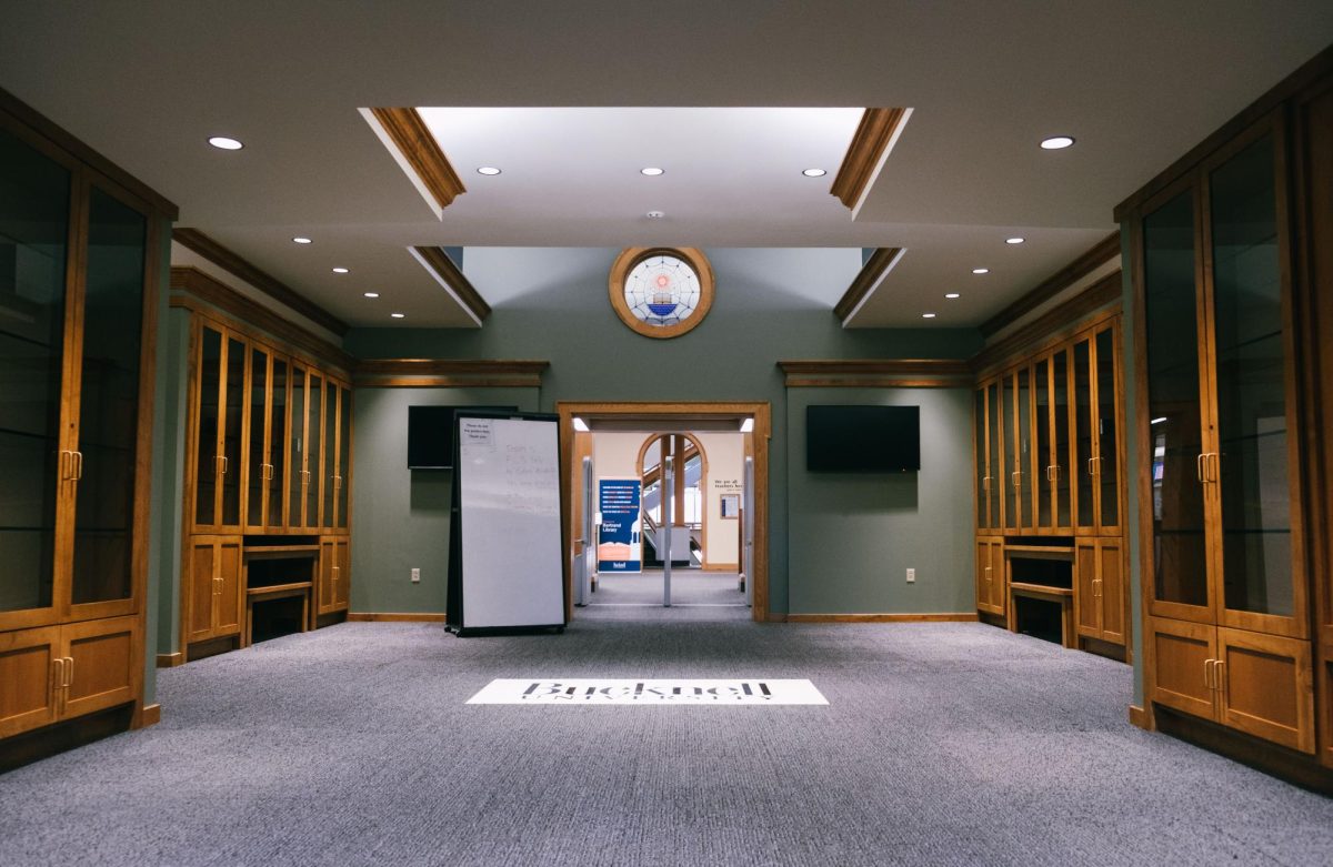
The whole library just screams mid-century modern. The biggest problem is the light wood color. For the majority of my first-year, I refused to go to the library; it distracted me too much. Yes, my friends were slightly concerned for me. Ashleigh Marmer ’25 says, “I’m always amazed by the fact that Morgan hates the wood color in Bertrand, so much so that she refuses to study there. However, I’m happy she is getting an outlet to vent her frustrations about this topic.”
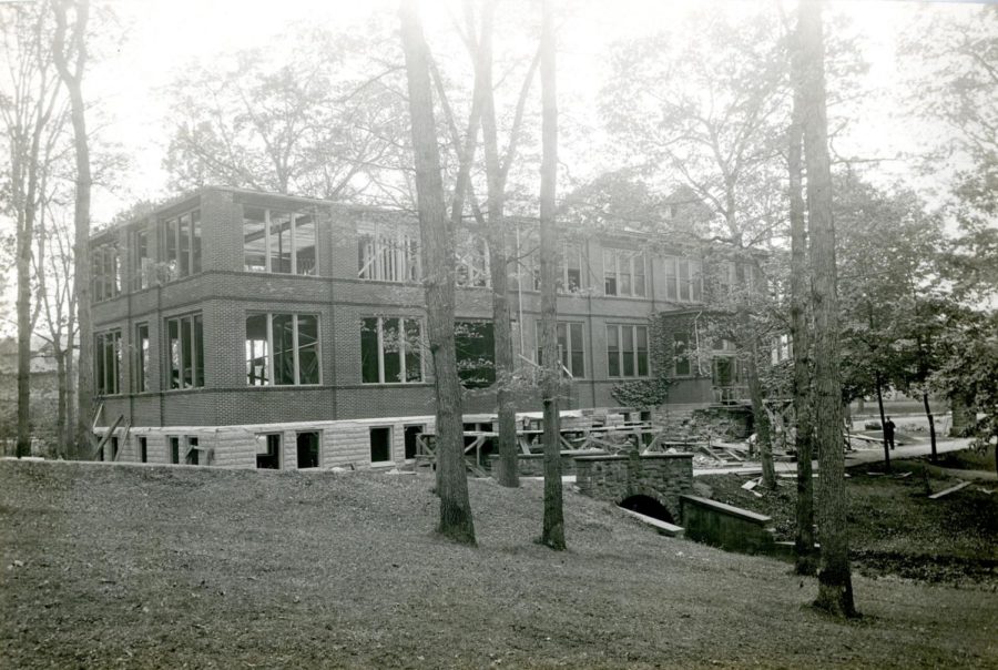
All I could think about was how utterly ugly the wood color makes the library, and how much better it would be if they used dark wood. At first, I refused to believe it was the original building, so being the history major I am, I researched it and dug deep. Spoiler alert: The wood color is original. And if you ask me, those architects made a dire mistake.
Now what does the student population think about this very important problem our school has been facing for decades? Eli Watkins ’24 says, “Personally, I think the wood color throughout the library provides a sense of nostalgia and adequately displays the historical academic success of the university.” I’d agree in the sense that the library does show nostalgia; but for the wrong time period. Who cares about the 50s or 80s? We want to be timeless. And timeless would mean dark wood.
While there may be people like Abby Paulnock ’25 who say, “I never noticed the wood color until it was pointed out to me. I have no strong feelings about it either way,” you must ignore them. The people want the dark academia vibes. Not the we built this building in the 50s, then renovated it in the 80s (and you can tell) vibes. Think about your Pinterest board of libraries (because of course, we know everyone has one). You are probably pinning the old European libraries that have a similar aesthetic to the “Harry Potter” series; not the Bucknell library from the 50s.
My favorite places to study are the Willard-Smith Library in Vaughn or Hildreth-Mirza. They’re quiet and peaceful, and obviously, I’m a humanities girlie. But also the most important thing that they have in common with each other is that they have a deep, gorgeous dark wood color, much different from the color in Bertrand. Even Carnegie has an acceptable wood color. It’s not too dark, fits the building, and it’s not that ugly light-wood color either.
The only thing fixing the library is a complete renovation. As Colton Jiorle ’25 points out, “The faded color of the wood paneling perfectly complements the musky smell of the periodical room, which is not at all coincidental since they are both probably from the 1980s.” The glass cubes in the staircase need to go, the light wood needs to be stained or replaced, and the bookshelves need to turn to wood. I would suggest a deep Mahogany or dark walnut shade. Will that renovation ever happen though? Probably not.
Will Holmes eventually look as dated as Bertrand and the ELC? Most likely. But we have not yet gotten to that point. I am sure when we come for our 50th reunion, we’ll have the same thoughts that the place looks dated. Maybe then, however, the wood color in the library will be back in.











Change the wood • Mar 31, 2024 at 2:50 pm
Totally agree!!!! Let’s change it!!!! Brave soul for speaking out against it