


Datawrapper offers new opportunities for student projects
November 19, 2022
Many of the tools surrounding presentations, slideshows and graphs remain repetitive and limit our abilities to express our creativity.
Datawrapper is a tool used to build charts, maps and tables that utilizes a wide range of different features to make your visualizations truly unique. Datawrapper allows students to immerse themselves in different dynamics to display graphs, charts and maps.
Datawrapper’s initial target demographic was surprisingly not students, but journalists and researchers that would use the application to display on different media sources. Some of these media outlets include the New York Times, Vox and Wired.
When the program made its way to universities, students saw this as an opportunity to expand beyond just general bar graphs. In terms of user accessibility, the program is extremely user friendly and there are different tutorials to catch beginners up to speed quickly.
When entering and creating a graph, the website will give you four options for inputting and using data. First off, you can simply copy and paste a data table within the interface, by using an algorithm Datawrapper will distribute that data into a map, graph etc. The second option is by uploading a XLS/CSV file directly from your desktop. In order to make a spreadsheet a CSV file, simply save the file directly as a CSV and move directly to your desktop.
The third option for uploading was the most common technique within our Foundations class, which was directly connecting a Google Sheet using the URL. The last option for uploading is using a link to an alternative dataset, which is any source besides excel and Google Sheets.
The next step before choosing your visualization is verifying your data, and making sure that Datawrappers algorithm uploaded it correctly. Next, simply choose your visualization type, with over 20 different chart options and additional mapping options
Datawrapper has a plethora of different ways to display your data. The map options include a choropleth map, a symbol map and a locator map.
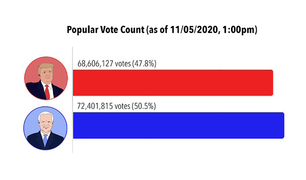
Using the 2022 midterm elections as an example, a choropleth map could display the different counties that were either red or blue. The symbol map could show voter density across the country or state. Finally, the locator map could display the different voting polls inside of specific cities; simply critique different variables such as, the title, colors, axes, etc. and upload.
Datawrapper also has the feature for creators to determine whether their data visualizations are accessible to color blind people. This ensures that creators’ graphs are able to be interpreted by every one of their readers, which many people may not think about. You will then have produced a professional data visualization graph or map, and can use the gallery feature to see different visualizations that have been created.